FEILD:
Branding
CLIENT:
Educational Business Partnership
DATE:
09/08/2025
USERS:
Businesses and students

about.
Context / Overview
The client is a non-profit company whose mission is to unite education and business to inspire and equip our future workforce for tomorrow’s workplace. EBP are rebranding to modernise their current identity with the aim to appeal to both corporate and young people alike. The client aims to relaunch with their new branding for the upcoming academic year starting in September 2025.

Aim of the project
The client aims to move away from the current, ‘dated’ logo and create a modern, professional, and trustworthy feeling through updated branding.
Objectives and Deliverables
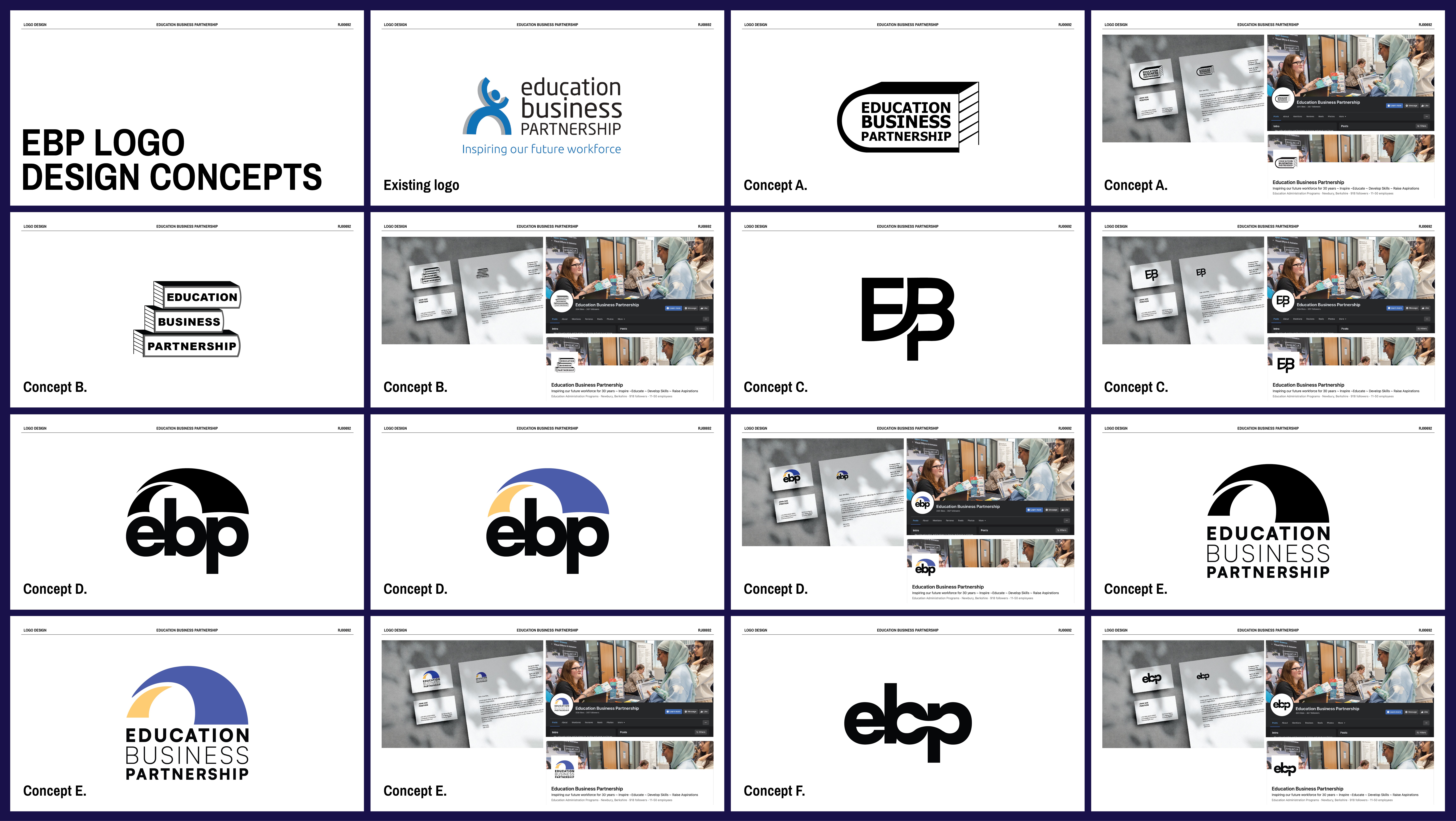
Through a detailed analysis of both the client’s current branding and that of their competitors/comparators, new branding will be developed with the aim of creating a more positive impact for the different stakeholders.
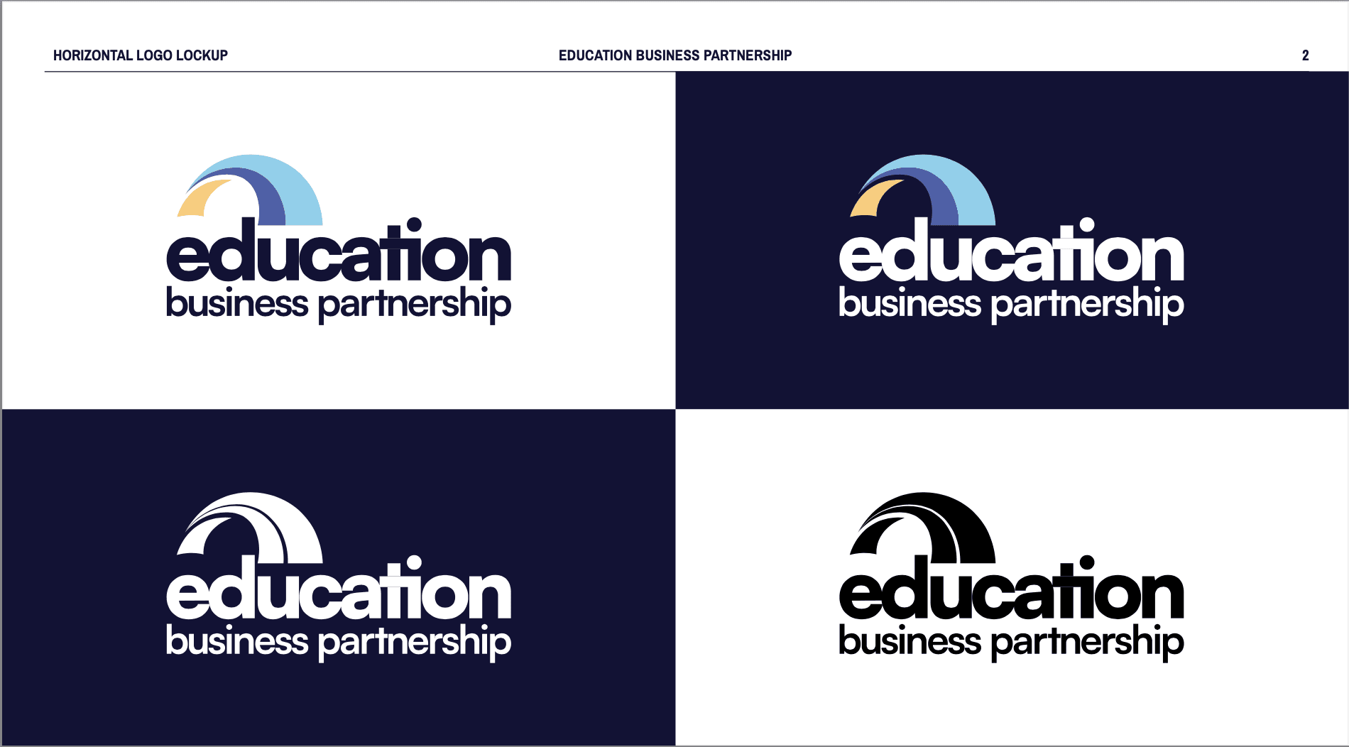
A logo
A set of clear and easy-to-use brand guidelines
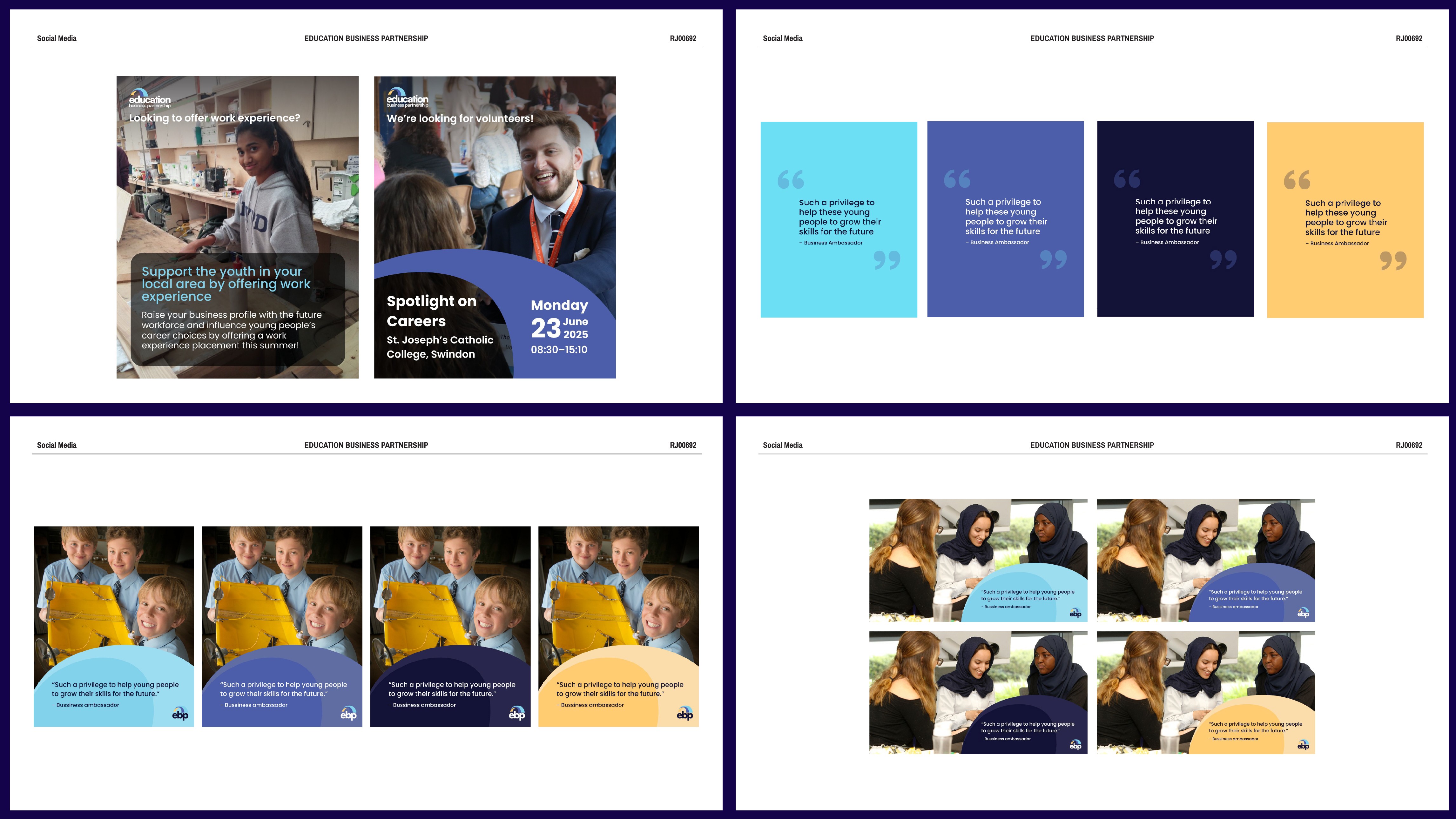
Five editable Canva templates for social media
LinkedinBanner
FacebookBanner
User needs
The new logo and branding should aid in the business appearing modern, trustworthy and professional to the user. The client has two very different stakeholder groups, one being corporate professionals and the other being young people who may benefit from the charity. Both of these user groups’ individual needs must be considered and met within the rebrand. Some key needs are to be approachable, friendly, and empowering, while also being professional, reliable and sleek.


challenge.
With all of the individual deliverables designed and finalised, we put together a brand guidelines document for the client to refer to and potentially provide to other designers in the future if they decide to rework their site with their new brand identity. Throughout the project, due to large file sizes, we were using WeTransfer to send over deliverables and documents. James Lloyd offered the insight that while this was okay for transferring folders and deliverables, the brand guidelines document being such a large file would make it very difficult for the client to send around internally. After this feedback, we compressed the document into a small enough file to comfortably send via email. This was a good lesson that when designing, it is just as important to consider the client’s user experience in handling the internal documents as it is to consider the end-user and stakeholders’ experiences.


Client feedback
“Tommy, Creamy and Diogo worked with us to come up with a rebrand for our charity. From the initial meeting, the team were excellent, professional and demonstrated a good understanding of our requirements. The work produced was of a high standard, and they listened to and acted on feedback and maintained good communication throughout the process. They demonstrated a high level of professionalism at all times, and we were absolutely delighted with the final designs selected. We would not hesitate to recommend them for any future work and wish them all the best in the future.”
Kate Barrow
CEO, Education Business Partnership

