
FEILD:
Branding
CLIENT:
Project Everyone
DATE:
13/06/2025
USERS:
Students
about.
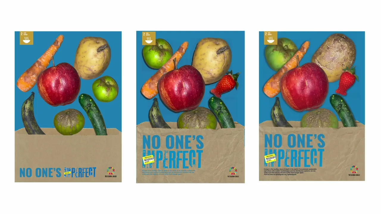
To promote the Sustainable Development Goals (SDGs), also known as The Global Goals, an A2 poster, an animated D48 poster, and a leaflet were designed for a group exhibition by communications agency Project Everyone. One of the twelve goals, zero hunger, was my focus for this project.
Goal 2 is achieving to end hunger, achieve food security and improve nutrition and promote sustainable agriculture. By reducing food loss and waste can play a big role in providing a healthy, nutritious diet to a growing global population. One of the solutions is buying funny fruit also helps sustainable food production and resilient agricultural practices, as it helps reduce food loss and waste, which helps sustainable food production systems, and improves land and soil quality. Since over 24% of fruits and vegetables are uneaten due to appear- ance, purchasing these “ugly” fruits keeps them in the food supply, increasing availability and providing affordable, nutritious options for consumers. Buying funny fruit aligns with the Zero Hunger goal by promoting sustainable food production, reducing waste, and ensuring more people have access to nutritious food.
To address the problem, a set of advertisements was created to promote buying funny food as a solution to reduce food waste.


challenge.
After printing the final outcome of my leaflet, I began crafting and folding it by hand. The biggest challenge during this stage was cutting out the paper bag shape. To accurately recreate the look of a folded paper bag, I had to carefully cut out the top section of the design, piece by piece. This process was time-consuming and required a lot of patience to ensure clean edges. Although it was challenging, the result added a strong tactile quality to the leaflet, helping it feel more authentic and reinforcing the physical motion of a brown paper bag, just like in my animation and poster designs.


result.
This project received highly positive feedback from both tutors and the client. My work was recognised as one of the client’s favourites for its engaging and impactful delivery. I was praised for my strong use of manual processes, including creating a custom typeface and producing original photography. These elements contributed to a distinctive and well-crafted final outcome, showcasing creativity, craftsmanship, and clear communication for the project.

