
FEILD
UX
CLIENTS
Investors
DATE
07/05/2026
USERS
Pre-diabetes patients
about.
Context / Overview
Many people in the UK diagnosed with pre-diabetes are told to lose weight but given little practical support on how. Existing health apps focus on calorie counting and complex data, which can feel overwhelming and demotivating.
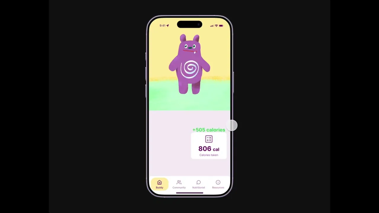
SlimBuddy is a supportive health app concept that helps people work towards remission without feeling overwhelmed. I took it from research and ideation through wireframes, usability testing and a final Figma prototype.


process.
User research
I interviewed a UK participant with pre-diabetes. She felt unsupported after diagnosis: no follow-up, no practical NHS resources, blood test results with no explanation, and no way to see progress. She also wanted peer support and clearer advice on what to eat.
User research
The interview became Hazel, a 45-year-old supermarket worker who wants to lose weight and eat healthily but struggles to stay consistent. She needs a tool that feels supportive, not judgmental. This led to three feature groups: meal logging with Buddy, community support and nutritionist guidance.
Challenge
The hardest part was keeping the app supportive without overloading people. Health apps tend to add more data, but my research showed that too much information is exactly what puts people off. I focused on simple cards, a friendly mascot and plain language, so every feature had to answer a specific problem Hazel had.
Another challenge was linking research to design. My first ideas centred on tracking, rewards and Buddy. Feedback taught me to connect each feature to a real user need, and that research, testing and visual design have to work together.
Design
Buddy is a mascot I designed to make the app feel friendly rather than clinical. Users log a meal in a few steps with their camera, then check and edit it. Tasks, progress and coupons make daily habits feel achievable. Blood test results are written in plain language, and the resources use image-led cards and illustrations I drew in the app’s style.
I built the interface in Figma on a customised design system, so colours, icons, cards and tabs stay consistent across screens. I also designed a tablet version.
testing.
I tested the clickable prototype with peers. They found Buddy friendly and motivating, and the community page familiar because it reminded them of Instagram. Feedback led to a coupon reward, plain-language blood test explanations, and a clearer resources layout with tabs and shorter text. A final round showed users wanted more personalised meal suggestions and logging reminders, which I’d build next.

